Orbit 1.5.6 — Room to Work
A look-and-feel release. The Overview page and footer lose their panel boxes and fill the window, Activity gains a numbered grid alongside the honeycomb, the 3D scene can take the full row and zoom on the sweet spot, and the level at which an object counts as active is now yours to set — down from roughly −30 dBFS to −62 by default. Plus a rebuilt object list with SILENT tags, a new Diagnostics panel, and the looping fix in build 4.
A look-and-feel release. The Overview page and footer lose their panel boxes and get the room back, Activity gains a second way to show objects, the Inspect sidebar is rebuilt to stay readable at high object counts, and the level at which an object counts as “active” is now yours to set.
No engine changes — this build runs the same OrbitCore as 1.5.5.
Build 4 replaces build 1. Looping was broken in the first 1.5.6 build: you could draw a region but couldn’t turn looping on. That’s fixed, along with a stale device picker in Preferences, and there’s a new Diagnostics panel. Orbit will offer you the update automatically. See Fixed.
If you installed build 1 yesterday or today — apologies. These fixes should have been in the first release.
A roomier Overview
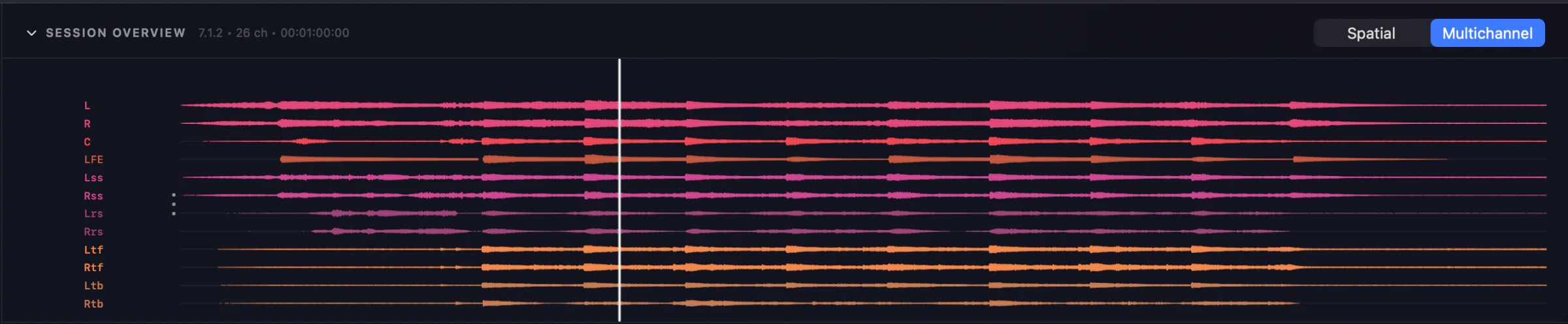
Every panel used to sit in a rounded box, several of them holding a second box. That chrome is gone, replaced by a title and a hairline, and the page now fills the window instead of stopping partway down it.
- The session waveform runs edge to edge — around 96 px wider on a typical window.
- The 3D scene more than doubles in height.
- The Session Overview title carries format, channel count and duration.
- The footer is one flat strip, so the spectrum stretches the full width between the meters and the loudness block.
Activity: hexagons or a grid
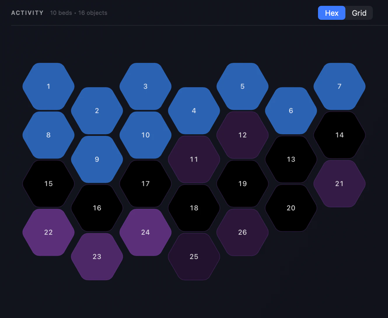
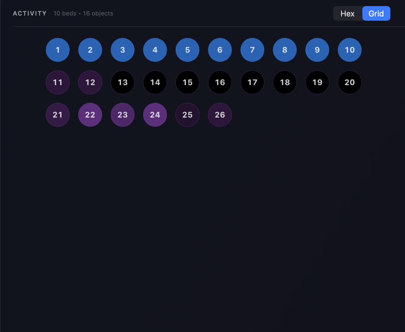
Two ways to show your channels and objects, switched from the Activity header on both the Overview page and the Timeline inspector:
- Hex — the honeycomb, now capped so a 7.1.4 bed doesn’t become a handful of enormous tiles.
- Grid — a numbered dot matrix in fixed rows of ten, the layout immersive renderers have used for years. Stays readable where the honeycomb becomes a wall of shapes.
A bigger 3D scene
- Fill the row — a button in the Scene header expands the 3D view to the full width, stepping Activity aside. Press again to bring it back.
- Zoom — scroll or pinch. It stays pivoted on the listening position, so you orbit the sweet spot rather than drifting off it.
- The Small / Medium / Large buttons have gone from the Overview’s Scene header (the scene already fills that space) and remain in the Timeline inspector.
Fill the row — Activity steps aside and the scene takes the whole width.
Zoom stays pivoted on the listening position, so you orbit the sweet spot.
Quiet objects no longer disappear
Audible-but-quiet objects could read as inactive — dimmed in the sidebar, missing from the 3D scene. The cutoff was fixed at roughly −30 dBFS, which isn’t quiet at all. It’s now −62 dBFS by default and adjustable in Preferences ▸ Appearance ▸ Object Activity.
Objects also fade around that level instead of blinking: the scene used to react to the raw, moment-to-moment level, so anything near the cutoff flickered. Expect more objects lit than before — that’s the fix; raise the slider if you preferred the old behaviour.
A clearer object list
Object rows in the Inspect sidebar read like the bed banks: name, solo and content group on one line, with ATU id, live position, width, importance and gain behind a disclosure arrow. View ▸ Show Object Details (⌥⌘D) opens them all at once.
Silent channels now say so. Once a file is scanned, any track sitting below −85 dBFS for the whole file carries a dashed SILENT tag — or “4/12 ch silent” when only some channels are dead — on bed banks and object rows. Dashed, so it can’t be mistaken for the live activity dim.
The Orbit mark, in orbit
Opening a file — and creating a session — now shows the Orbit logo instead of the old blue orb, with the satellite ring running its orbit and a short trail behind it. Same moment, our mark rather than a generic pulse.
Panels have a sensible minimum
Both side panels stop at a width that still fits their contents, and share the same minimum. If you had either dragged narrower it will widen itself on first launch — the new floor, not a glitch.
A Diagnostics panel
Preferences ▸ Diagnostics — a read-only page showing what Orbit and your Mac are actually doing: render load, render times, underruns, buffer and sample rate, the output device and layout, and your machine’s CPU, memory and thermal state. Copy puts the lot on the clipboard for a support ticket, or Email to Support opens a message with it filled in.
It never includes file paths — the loaded file’s name, never where it lives on your disk.
Fixed
- Looping couldn’t be switched on (build 4). Drawing a region worked, but Playback ▸ Enable Loop stayed greyed out and the L key did nothing. Dropping a marker after drawing the region was the only way to wake it up. Region edges and moves were affected the same way.
- Drawing a region is now undoable (build 4). ⌘Z used to skip straight past it.
- The output device picker showed the wrong interface (build 4). Changing your interface in Preferences ▸ Audio & Monitoring switched the audio correctly, but the menu carried on displaying the previous device until you left the panel and came back. There’s also a new Refresh button — plug an interface in with Preferences open and it appears without a restart.
- Inspecting a track, then opening another file, left the timeline blank with no way back to All Tracks — the button did nothing and only reloading recovered it.
Requires macOS 14+. Update to Orbit 1.5.6 today — Orbit will offer you build 4 automatically. Anything feel wrong in here? orbitspatial.io/account/feedback.
Stable build — v1.5.6 (4). Replaces build 1.
— The Orbit Spatial Team